Beverage Cans: The Packaging of 1000 Faces
The design and decoration of beverage cans may appear, on the surface, to be a straightforward affair, but there is far more to achieving an outstanding result on shelf than simply choosing some pretty shapes and colors. There is also a psychological element to be considered, as design plays a major role in how consumers perceive and differentiate between dozens of packages on display. In addition to brand image, design helps distinguish a craft beer from an energy drink from a canned water or soda, and while this may not be something most consumers are aware of, the subconscious will certainly be taking note.
Fortunately for beverage brands, the can is the perfect canvas for creativity to thrive. The metal substrate offers a near infinite number of shaping and sizing options, while decorative techniques have advanced significantly in recent years. A 360-degree brandable space is waiting for a striking and efficient design, ready to covey a brand’s image with a freedom that is simply not available with alternate substrates. The versatility of aluminum cans makes them an ideal choice for all drinks categories and audiences, and the format continues to increase in popularity as a packaging format around the world.
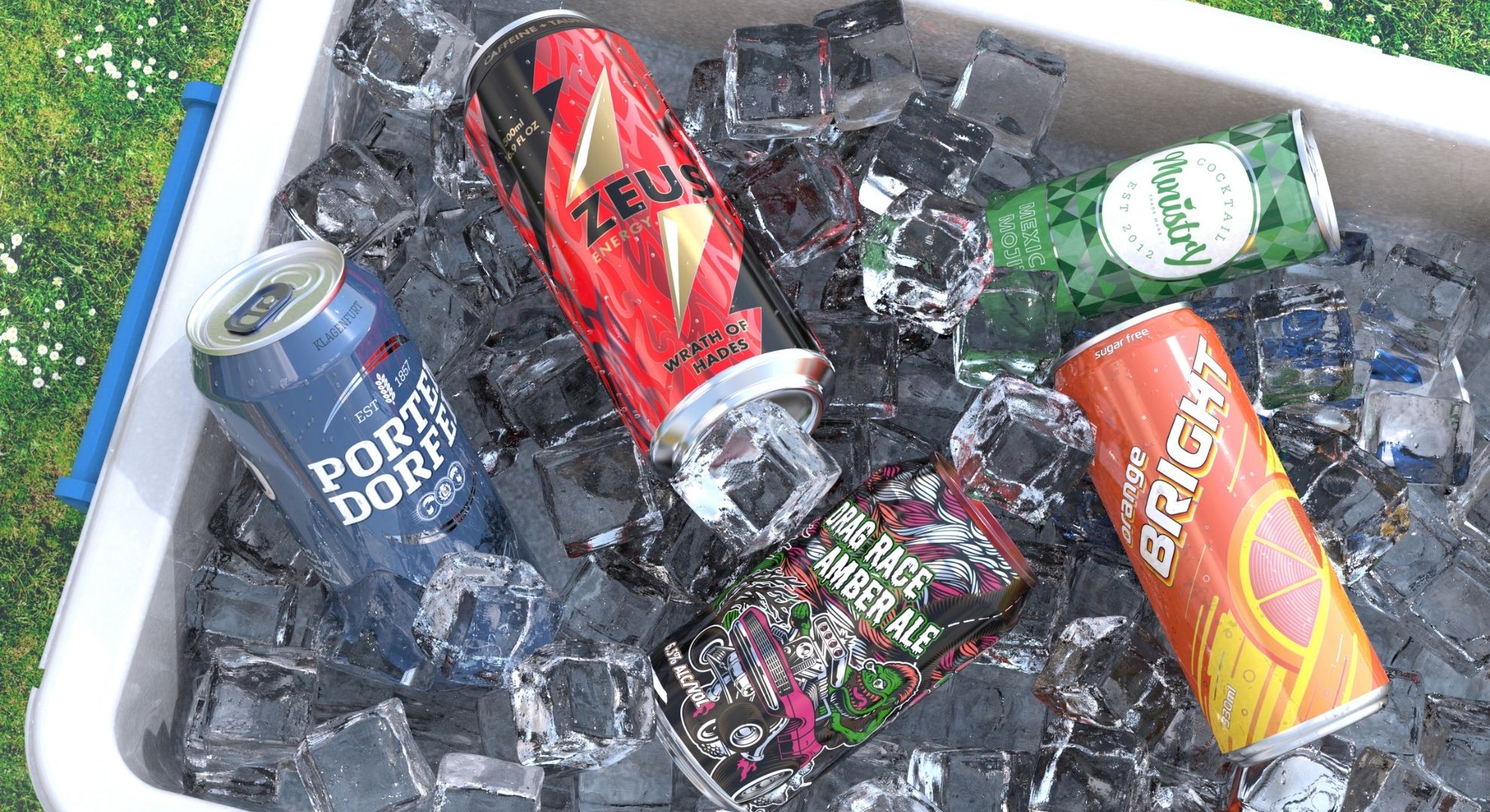
So, how do certain beverages stand out loud and proud among the competition? Well, if we take beer and other alcoholic drinks as an example, these cans are likely to feature a matte varnish and minimalist designs to appear more premium for a slightly more mature audience, but that does not mean the designs are in any way muted. Cruzcampo is a great example of a successful and efficient promotional campaign involving cans, featuring bright and vibrant images that are accentuated by the natural color of metal under a matte varnish.
Taking full advantage of the can’s 360-degree brandable canvas for its summer campaign, the beer brand commissioned 12 different images to highlight its proud connection to Andalusia. The package also featured our Accents technology, which allows a design to vary on each can in order to create up to 24 unique graphics in a single production run, to deliver a truly memorable and collectible product.
Then there is the trend toward water in cans, which is often sparkling or flavored. These cans tend to use whites, blues and greys to signify the purity of the product, which are also colors that lend themselves to the feeling of wellbeing. Brands often opt for a sleek can design, and where flavors are present, the ingredient is often highlighted and depicted in a subtle shade relating to its color – a strawberry or orange, for example. Fruits are a great differentiator when dealing with multiple flavor options, while plain waters can accentuate the white color often used with a blue for still water or a light green for sparkling. WAMI, an Italian water brand with a twist, which aims to make a difference to millions of people who lack access to clean, accessible water, used this color scheme to great effect in the product range it launched to the market in 2020.
Soft drinks are another popular category for beverage cans. These packages tend to use the substrate more effectively, drawing on its reflectivity and cold touch for a refreshing look, while the energy sector favors darker designs (black/navy blue), bold (colorful) letters, and geometric patterns, animals and mascots. These engaging designs often feature tactile finishes and the use of thermochromic inks, which change color according to the temperature of the contents. Soft drinks brands have been successfully using the canvas of the can for catchy promotions that proved popular among the consumers.
Finally, there are those that break the mold and decide to go with fun designs to attract younger audiences. To bring its brand story to life, Zai Urban Winery assigned six distinct cartoon characters for each of its organic wines, all of whom play a key role in returning wine to the world. All wines are available in 250ml cans, and the designs are guaranteed to stand out due to their unique style and bold use of color.
Ultimately, the ways that brands can use metal packaging are near limitless – they can literally have 1,000 faces and more - but these general rules are often applied to ensure consumers are led in the right direction in terms of their purchasing decisions. Brands will continue to innovate to ensure that appeal remains strong, and we will continue to support them with ever more innovations in beverage can design into 2022 and beyond.
Related Articles
Crown Holdings Schedules Second Quarter 2026 Earnings Conference Call
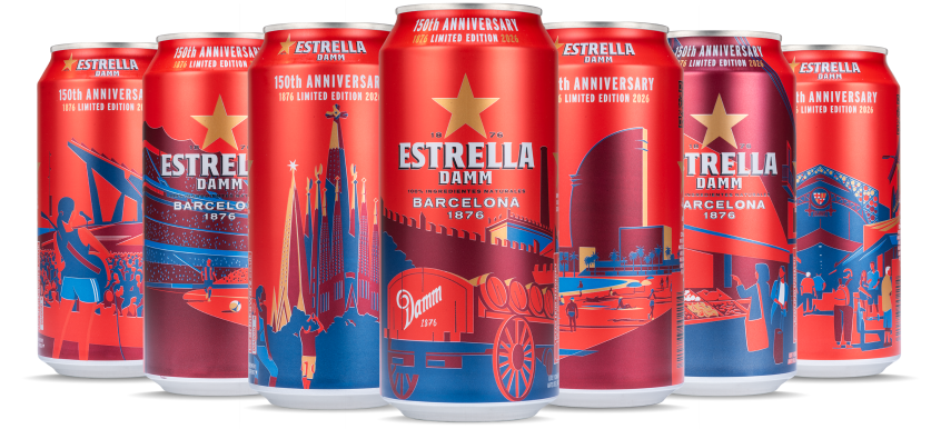
Damm celebrates its 150th anniversary with Accents™ Color technology from Crown
Crown Holdings, Inc. Appoints Ozgur Atas President of Asia Pacific Division
Questions for Crown?