Printing Like a Pro

The best package designs appear effortless. However, behind every finished product is far more planning and precision than meets the eye. This is particularly true when it comes to designing graphics for beverage cans, which requires distinct skills and expertise to effectively translate imagery and deliver the intended quality. When created with precision, the right can designs yield a premium appearance and boost shelf appeal for brands competing for shelf space. As a first step, brands can utilize resources like the on-site experts that call our graphics studios around the world home. Our latest location is in Ambler, PA; we also have sister sites in Leicester, U.K., and Dubai that provide similar service and support to customers.
While imagery, color, and layout play an important role in any package design, there are important nuances for printing on metal. To begin with, aluminum does not offer the same stark-white background that a computer screen or paper label provides. By nature, the material is silver in tone, and designs and color choices must account for this difference. When selecting inks for the design, careful color-matching must occur to ensure the right saturation and tone are carried over to the can’s surface. This step is crucial for consistency in brand colors and imagery across product materials or graphics that may get printed on other substrates. Our team can simplify this process by pinpointing the correct colors. We often pull from INX colors, which closely mimic Pantone shades.
Following agreement on color choices, a can design will go through the separation phase, which will break down each shade to the pixel—a process that takes eagle-eye accuracy. The separations also prepare the design for its eventual use on printing plates, reinforcing the need for placement and layout to be extremely precise. Although microscopic color selection is an art form in itself, there are several other aspects of can design that require special attention. For example, when printing on cans, there must be appropriate space between each solid ink color to ensure the inks do not get contaminated. Keeping these minute yet critical factors in mind helps ensure that the fine details of any graphics, messaging or brand logos shine through.
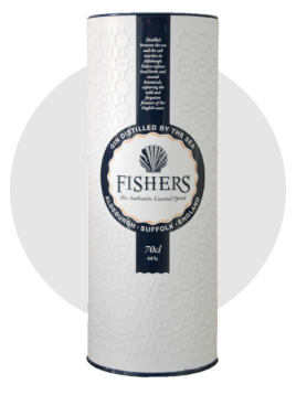
Finally, understanding the shape of the physical package is key. Beverage cans offer a 360-degree surface that can be decorated from top to bottom and left to right with vibrant imagery—providing brands with ample room for storytelling. When printing on this wrap-around real estate, it is important to anticipate how the curved surface will impact the layout and potentially change the shape of any design elements. To ensure consistency between various SKUs and/or formats, brands should work with designers and a prepress team who can properly prepare a flat design for its cylindrical debut.
While designing for beverage cans takes particular skills, foresight and attention to detail, leveraging the right expertise and resources can produce a stand-out beverage can that commands attention and makes a splash in the market. With an impeccable can design, beverage brands can feel confident they won’t get lost on store shelves.
Related Articles

Crown’s New Sustainability Report Emphasizes Forward Momentum Toward Achieving Twentyby30 Goals
Crown’s Design Capabilities Recognized with Multiple Award Wins in 2020
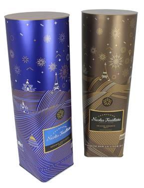
Nicolas Feuillatte Goes 100% Metal with Crown
Your Partner of Choice at BrauBeviale 2019
Questions for Crown?